Georgina Hammond
Animator
 |
|---|
 |
 |
 |
 |
 |
 |
 |
 |
 |
 |
 |
 |
 |
 |
 |
 |
 |
 |
 |
 |
 |
 |
Geffrye Museum - Set Design
So the new task is to create an interior set design but not just any set design, we need to show time passing and an event happening with just the room, no characters, no talking, just the room and some sound effects. These sets will then be on display at the Geffrye Museum – for people to actually see!
First port of call - Geffrye Museum! So we spent the day here doing some visual research, looking at the rooms we liked and decided on a time period we wanted to work with. After walking through every room a couple of times I decided the room I liked most was the room from 1965. Due to this I decided I wanted my set to be based in the 60’s
After taking some sketches and some notes, the next job was to do some brain storming – decided on a rough idea of what I might want my set to look like then doing some research on furniture and items I might use in my own set.
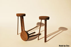
Then came the creative part! Making the set! The key part of making the set was to do so using found materials and recycling, not buying miniature furniture! So this made the building much harder but so much more fun, we had to be more creative and see past a pile of rubbish. I teamed up for this job with Cleo as he was making a room from the 60’s and our disruption idea and our room owner were almost the same, this made the building easier as we shared jobs and made our own parts. We remade our set around 4 times before we made it to our final set.
I’m extremely pleased with our final set, it’s a lot better than I had imagined, however there are still changes to be made to make it even better. The doors at the back need to be made bigger as once we put the kitchen in we discovered that they were much too small. We could also do with neatening up the walls and a bit of painting here and there to make it look tidier.
Location Sketches
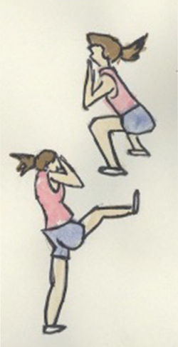
To help with character designs and drawing realistic body shapes we went drawing on location. we spent 3 hours in Spitalfields Market drawing anyone who took our fancy. This is something I also do in my spare time to help improve my drawings of human form, above are some examples of this.
After drawing I then painted with watercolors to give them more shape, definition and personality. although I'm not very good at it, painting with watercolours is something I really enjoy and would like to better myself at so I will be doing this more often in my spare time
 |  |
|---|---|
 |  |
 |  |
Monoscenic Narrative, Semiotics & Semantics
As part of my interior design project i'm looking into how Monoscenic Narrative, Semiotics and Semantics can tell the story. For this research I have looked at two videos;
Up
The first shot from up is very bright and cheery, showing the couple decorating a babies nursery and putting baby furniture together. The first impressions you get is that the room is warm, cozy and pleasant. Both of the characters look happy throughout the scene and look excited preparing. This scene clearly tells me that they are either trying for a baby, I would assume that the female is not yet pregnant as she is standing on a tall ladder and this is something I’m sure she wouldn’t do if she was already pregnant.
In the second shot we see a much darker room, there is a lot of shadows and the room gives a sorrow and sad feeling. It is the same couple from the previous shot of decorating a baby’s room with the female sitting and the male stood behind her looking to be comforting her as she has her head in her hand, I assume crying. There is also a man standing in front of them wearing a long white coat suggesting that he is a doctor. Along with that on the wall in the background is a poster of a pregnant woman. All of this together suggests that maybe they can’t have children or have lost their baby during the pregnancy if she was already pregnant.
Vera Drake
The first image is of 6 women, all very well presented in upper class clothing, sitting straight and looking respectable. They appear to be in a tea room as there is sandwiches on a stand and tea and cake on the table, the interior is very clean and of rich colors which suggesting that it is for upper class members of society. The woman in focus has a handkerchief over her mouth and she is looking down looking sad or even crying. It looks as if she is confining in her friend suggesting that she is upset by a private and personal matter.
In the second shot shows the same woman, this time in a darker room with a man, the man is very well presented, professional looking and also stern looking. Theyre are what looks to be certificate on the wall and a desk with a chair either side, also an examination bed where the woman looks to be getting herself dressed behind a curtain. All of this together suggests that he is a doctor and she is in his surgery. The woman looks nervous and even scared.
Putting scene 1 and 2 together makes me assume that she is currently going through an unwanted pregnancy. I assume it is unwanted because of her being on her own, if it was due to her not being able to have kids i would assume that she would have her partner with her.


Going Equipped
Going Equipped is a short animation by Aardmans Peter Lord. The animation focuses on telling the story through objects and locations rather than using characters. The task was to look at the video and draw our own version of the sequences and look at the overall mood and composition of each shot and how the objects illustrate with what is being said.


History of Animation and Genre
Define the theme in Star Wars by listing a set of motifs (defining objects of time/place), and find parallels to these in the Spaghetti Westerns e.g. XAWing versus horse or lightsaber versus gun.
Colour Used for Characterization
Certain characters in the Star Wars trilogy are closely identified with certain colours, with Darth Vader’s all-black outfit being the most obvious example. Vader’s black makes a stark contrast with Luke’s all-white clothes in A New Hope, hearkening back to the serial westerns of the 1940s and 1950s, in which the good guys had white hats and the bad guys wore black. Leia wears an all-white costume in A New Hope as well, signalling the goodness of her character and linking her visually with Luke, her (unknown) brother. The Jedi Masters Yoda and Obi-Wan favour brown, a warm colour recalling a monk’s robes and the earth itself. Han Solo, meanwhile, wears a white shirt with a black vest for much of the trilogy, in an apt reference to the initial ambivalence of his character.
Orchestral Soundtrack
John Williams’s thematic compositions for the Star Wars trilogy have been justly acclaimed, and the films use the soundtrack expertly to heighten the drama and intensify the mood. At a time when pop music was being used more and more in film soundtracks. There is an intensity and excitement in the Star Wars music, especially in the heroic opening theme, with its instantly recognizable fanfare, which contributes greatly to film’s overall effect.
Lightsabers
The lightsaber is, as Ben teaches Luke, the traditional weapon of the Jedi.
The Death Star
The exact symbolic meaning of the Death Star is ambiguous, though it is certainly a symbol of evil.
Overview of our Rapunzel Project
Being as this was our first project we was thrown straight in and had to work hard from the off. I was part of a 5 man production team and the task was to reinterpret the story of Rapunzel as a western. The final animation was then on show at the Rosemary Branch Theatre’s Suspense Festival. There was a lot of pressure to get the work done but it was a lot of fun and a great way to start off.
Our initial ideas came to us quickly, we spent about an hour in the group brain storming ideas, a general plan of what we wanted to do, some rough story boards, character ideas and plenty of notes to help us through;
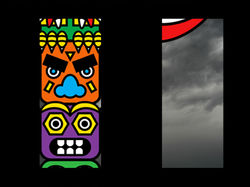
Initially, we decided that everyone would work on one or two scenes on their own but we quickly discovered that this wouldn’t work, after some time wasted we then decided to start again with everyone focusing on a certain aspect of the animation. I focused mainly on the animating side of things, getting the video put together, making the characters walk across, making the animals fly, finishing the video up and getting it complete. Tony was in charge of everything that needed to be done on Photoshop such as making up the backgrounds and designing the characters. Shivvy was in charge of the animals, designing and creating them. Franny made and animated the curtain scenes and Peter was in charge of the animation on the Totem Pole, the eyes moving etc.
As not only our very first production of the year but also our first group production I feel the entire task went very well, I’m really pleased with the final outcome and think it looks almost exactly as I had imagined at the start while planning. Unfortunately I was unable to attend the show but those that did go have told me it went very well and the show over all was a great success which give me a lot of confidence for the future.
 |  |
|---|---|
 |  |
 |  |
 |  |
 |  |
 |  |
After Effects Notes
- Make the Characters bigger than the screen size you will be actually working on - Rapunzel characters made in 2000pixels X 2000pixels
- First off, set the composition then import characters - PSD File - as composition.
- If there is space you dont need, you can change the composition any time by going into the composition settings.
- You can change the background colour or make it transparent.
- At the bottom ofn the third window you can change the composition quality - downscaling the quality can make it eaier to watch the movement.
- Action Safe - puts a boarder around the work space and indicates where it is safe to place the work to prevent the edges being cut off.
- On the left is the layers, clicking on the arrows gives you options for movement, scale, position etc.
- To make movements you need at least 2 key frames. the first key frame at the start of the movement and the second key frame where you want it to end. when you want to make the very first key frame you need select the stop watch on the layer section, then move the time indicator to the time you want the movement to stop, then more the work to the ending position you want the work to be in and that will automatically make the 2nd key frame. you can then add the exact movement you want it to make.
